Saturday, 22 December 2012
Friday, 21 December 2012


Question 1 final:

Above: The programming used to create this webpage of text and images.

A screenshot of the webpage template I produced.
A video showing the entire document I created. Complete with the Digipak, poster and video all inserted as soruces of evidence and reference for my text.
Monday, 17 December 2012
Another tech change:

Thursday, 13 December 2012
New evaluation tech:
Instead of a simple Prezi software usage for the recreation of Question 1 for my coursework, I have decided on using html to produce a coded document that reviews the coursework products I have produced. I decided on this since it is a rare use of technology for a media evaluation task. It will also be organised and structured via the use of programming values and functions.
Tuesday, 11 December 2012
Evaluation technologies:
When I change my questions from draft to final format, I will be using the following technologies, as hinted by my question 4 draft PDF file, to place them into...
Question 1: I will use Prezi to format this question. This is because Prezi is a software online that when used can effectively and presentably separate chunks of text and make an essay based question like the way I produce question 1 seem a lot more presentable, and look a lot more attractive.
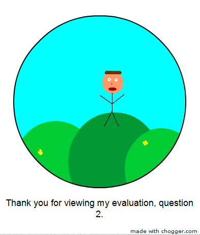
Question 2: I will use Chogger software produce the final form of question 2. Chogger creates basic comic designs. I will style a basic cartoon looking comic that explains question 2 effectively.
Question 3: I will use Drawplusx6 software to produce the 3rd question into final format. This consists of an image that will be developed using various text and images that will accomplish answering the 3rd question in style and detail.
Question 4: I will use Movie maker 2.6 Windows software to produce the video that will display the content to question 4. The video will consist of images from Google that display what technologies I used in the coursework, and a speakonia text feature will also be playing over these images.
Question 1: I will use Prezi to format this question. This is because Prezi is a software online that when used can effectively and presentably separate chunks of text and make an essay based question like the way I produce question 1 seem a lot more presentable, and look a lot more attractive.
Question 2: I will use Chogger software produce the final form of question 2. Chogger creates basic comic designs. I will style a basic cartoon looking comic that explains question 2 effectively.
Question 3: I will use Drawplusx6 software to produce the 3rd question into final format. This consists of an image that will be developed using various text and images that will accomplish answering the 3rd question in style and detail.
Question 4: I will use Movie maker 2.6 Windows software to produce the video that will display the content to question 4. The video will consist of images from Google that display what technologies I used in the coursework, and a speakonia text feature will also be playing over these images.
Friday, 7 December 2012
Thursday, 6 December 2012
Tuesday, 4 December 2012
Monday, 3 December 2012
Media experience:
As part of my evaluation, I have now got to review my coursework progression. I must answer the questions put forward with significant amounts of detail and illustration. One way in which I understand the progression of my work is through the use of the DIKW model. The hierarchy explains the difference between understanding and wisdom. Throughout my questions, I will refer to this model when relevant, and will explain my progression throughout my work.
Friday, 30 November 2012
Final music video production: Day 7.
The main section of the coursework is now complete. The filming and editing of the video is finished and seems to be of a high standard. My video has been selected from an option of many versions, and the editing used may be minimal in required effort, but very high in required effectiveness towards quality and presentation of the video. Now that all media products have been created, I must now go on to evaluate my work.
Final music video:
My final music video is complete by the deadline date, and has been submitted to the English office before 3.10pm. Ultimately, I decided on using version 6, with the use of a crop of the edges of the video. The singing is closest to matching perfect lip-sync and the editing technique of the gradually decreasing lighting seems effective.
Thursday, 29 November 2012
Final music video production: Day 6.
Today I managed to edit all 6 videos from the previous post, this being that my type of one-shot video does not really require any complex procedures.
However, the while versions 1, 2 and 5 were not edited, the other 3 had the following to them...
- Lighting effects. As the mood of the video became more dark and negative, the lighting matched this mood, as the lighting settings, edited in Movieplus x6 software, gradually became darker as I split the clips and decreased the brightness by 1% each time the next part of the video played.
- There was a slight cropping on the 3 edited videos to centre more on the sofa and the two people. The shadows somewhat viewable from the left become less apparant after cropping.
- Saved in mp4 format. According to Movie plus software, it saves in fairly high quality and not too much memory is necessarily required either.
Wednesday, 28 November 2012
Final music video production: Day 5.
Today me and the teachers, and even a student or two, decided on which take was the best. I decided I liked the attempt where I am not singing, but despite the slight screw-up in lip-sync that I performed during filming while singing, the others claimed they liked the video with me actually singing in it. With this, I decided that I will post a total of 6 different videos onto the Blog. From the 3 of the best 5 takes, including the one where I am not singing, I will upload two videos from each of these 3 selected takes. 3 which are unedited besdies the simple addition of the soundtrack being placed over it. 3 which contain basic editing techniques inserted. Out of these 6 we will decide which one to submit for examination.
Tuesday, 27 November 2012
Final music video production: Day 4.
Today I started to edit some of my takes. I have as of now saved two versions of my final music video onto a memory stick, both of which I will upload tommorow. I am also undergoing processes of editing, including adding a lighting effect, and cropping edges of the video to remove some of the unwanted shadows. The version of the video that contain me singing have accurately been placed in-sync with the music track I have inserted over it. The video is a significant improvement over my draft, and the girl actress must be commended for her amazing contribution towards the making of the video.
Monday, 26 November 2012
Final music video production: Day 3.
26/11/12.
Today, I have updated my Blog posts and have checked my progress. I will begin to edit footage tommorow, after deciding with my teachers which take of the footage is best to use. Since the entire video is one shot of the sofa as my female actress performing while I sing, or not, the choice is between 5 finalised and relatively successful takes. 4 with me singing, and one without as a back-up resort method.
Sunday, 25 November 2012
Final music video production: Day 2.
25/11/12.
Today I have once again checked over the footage I have taken and have decided to use all non-useful footage as bloopers. This additional quick and short video will symbolise the progression we made during filming stages, and the mistakes that were made and how they were corrected for the final take. I also intend to use editing in such ways as trimming off the edges of the video files. (For instance, you can see the actress’s shadow in parts of the video on the left of the screen, effectively breaking the fourth wall and ruining production techniques in the process.
After checking over the footage, I used a sample of screenshots from the video being played in windows media player to show how to performance made reflects the intended effect very well... all of the actions, from serving the meal to the reading a book have all been done very effectively in the media takes I have produced.
Shots of Footage
Saturday, 24 November 2012
Final music video production: Day 1.
24/11/12.
This is the first day of filming. Today has been 2+ hours of non-stop prodcution, from explaining the idea, to performing numerous takes. At least 15 of them. Out of all these attempts, about 5 were reasonably successful ones, and these will be those of which are taken for a decision making process over which one ism the best for usage in the coursework. I produced 4 successful takes which all required me to sing the song of I am Kloot proof while conforming to the anarachronism idea suggested by the teachers where I sit there and sing while the female actress performs all the acting and narrative in the video. I produced another successful take which shown the same thing but without me singing to the lyrics, since while I was able to generally match my mouth to the lyrics, there were certainly some errors made that may not even be fixed in editing. The video needs to look very well produced, and this is a back-up idea I have for my final video prodcution.

After recording the footage onto a school camera, I trasnferred all files to my memory stick. As you can see, the outcome of the filming is that 5 successful attempts were made, along with many bloopers, 3 of which I kept as sample to demonstrate errors in filming during the process itself...
Friday, 23 November 2012
Final video shot diagrams:
Upon reading Mr Smith's note yesterday, I realised that he has a point that the female actress will require some further detail and understanding of exactly what the music video is supposed to be. With this said, I decided against the Animatic idea, since I am running out of time to produce one, and because my drawing skills are severely limited as demonstrated for my first Animatic I made. Instead I decided to use simple but interpretable PowerPoint diagrams to show what each shot is supposed to be like:
Final Video Shots
Final Video Shots
Music video daily progress keeper:
This is a short but useful way of using time management skills to measure my progress and complete production of the music video to a good standard by the deadline. (1 week.) Filming will begin tomorrow morning, so I will require maximum effort and commitment next week during the editing and finalising stages of production. At the end of each day, I will be posting on my Blog to state what I have completed during the day. I will do this to keep track of time and weigh what I have done to what I still need to do. Since the video is mainly one shot of me on the sofa, there should not be too much editing required, but the timing will still be tight since I have had to wait this long. The actress should certainly make it this time.
Thursday, 22 November 2012
My review of the Digipak + poster:
As part of my coursework grade, I will require to evaluate my products. As preparation and extra progress, I have decided to evaluate my final Digipak and poster products:
Self Assessment
Self Assessment
Tuesday, 20 November 2012
How I can use cross media production:
In other words, how can I make my Diigpak and poster relate to my actual video. During development of these products, I had to try and relate my Digipak and poster to the video I was planning to develop.
Unfortunately, my previous plans for my video did not consist of the current idea or its properties that I recently discussed with the teaching staff over. My idea was still based on my draft at the time of development of even the final stages of these 2 products. This means that my backgrounds, images used, fonts, colours, all related more to that video of a trapped, entrenched soul that was suffering from booze and being punished by heartbreak. That was why I used my wall with the prison image, AKA the barbed wire, for my front cover, besides it being a Calvin Harris inspired cover. The use of the brick wall in my Digipak and poster was significant, and it supplied imagery of being trapped, tortured, punished, and suffering.
My current video idea does relate to that sort of imagery and presentation vaguely and subtly, but not as entirely as the previous idea. In order to produce a series of products and a video with consistency and use of cross media production, I need to consider how to make my productions relate…
Firstly, it seems that the use of an anachronism will be used, AKA an incorrect time reference. It seems that a cross between chronologies will be used to create an effective narrative visually. On one side of the sofa in the shot, I will be sitting still, more or less, talking to the camera, singing the lyrics to the Proof song. Meanwhile, the female actress I am using will be performing most of the visual acting. She will be acting a year relationship in 3 minutes, while I am in another time period, after she has left, reflecting on the relationship we once had. It’s like I’m not even there. (In terms of logic and correct chronology, I am not.
Now, with this storyline there comes some obvious mental punishment. Some psychological entrapment of the man in the video’s mind. He is suffering inside due to being punished because his girlfriend has left, and he is trapped because all he can do is sit back and reflect and what events have transpired. Basically, you could argue that the man in the video still possesses all of the same negative mood qualities that he had in the previous idea of mine. He is still trapped, punished and tortured inside because ‘everything that has transpired’ in the relationship that took place before his reflection process in the video ‘has done so not according to his design.’ This means that the Digipak and poster bare significant relevance to the video because the brick wall image and other use of presentation in these products relate to the narrative of the music video. It may be beneficial for me to provide emphasis towards these moods during filming and editing of the video in a procreative way…
Friday, 16 November 2012
Time plan contingency:
Since my video will now require all footage to feature the girl acting, I will obviously have to change my time plans. Also, the video is now a somewhat different idea to the improvement I had in mind. Since the girl can no longer make it until the weekend before the deadline, AKA one week after originally intended, the schedule will now have to be altered significantly...
Time plan error and contingency plans:
Time plan error:
Time plan error and contingency plans:
Time plan error:
The error was that I was originally intending to film the footage for the video on 17/11/12 and then have a solid fortnight based time slot for editing and making necessary improvements. The problem being the female performing artist in the music video, pulled out due to personal issues that conflicted with my filming plans. She could have only made it to the house for filming during the day, and since the film takes place at night, and since we need some time and she was on a tight schedule for this day, the occasion had to be cancelled. With this problem in my plans to manage time during video production, I will now need to declare that filming will take place on 24/11/12. I will also need to use this experience to reflect on my planning. I will now conduct a brief but effective contingency plan schematic in which I will determine what I must do if something else goes wrong…
Problem:
|
Effect:
|
What could go wrong:
|
What to do about it:
|
Female pulls out of filming again on 24/11/12.
|
Filming is now incomplete and can seemingly not be complete and edited by the deadline.
|
I fail the coursework due to either failing to film the video or film it in the week, then not have time to edit it properly.
|
I have already arranged a date for filming with the artist, and have constantly reminded her to be there for the date. Last time, the problem’s source was that she forgot that she was supposed to be filming and made other plans.
|
I cannot gain access to a decent camera for filming on the day.
|
Filming can now no longer be conducted and I cannot make my music video.
|
I fail the coursework due to not completing the music video and not getting any filming done.
|
I plan to use the library camera and book it a day or two in advance to combat this problem. If this option is not accessible, then I will either borrow the female artist’s camera, use a family members camera. Or if worst comes to worst, film with a webcam or phone, though quality will be limited if we use this.
|
School is closed due to damage, bad weather, etc…
|
I cannot progress with my work. The longer an event like this takes place the greater the significance…
|
I fail the coursework due to not completing the production of the video, not being able to hand in video at deadline, etc…
|
I will have to work at home if this occurs, since I am working solo, this won’t be too big of a deal. I will have to use what software is available on my home computer to complete both production of the video and subsidiary tasks…
|
Computers stop working or internet access fails.
|
Faulty electronic system used by the school computing error, etc…
|
My coursework is failed because I cannot use essential resources for my video production and other tasks.
|
If I cannot work at school for a significant time period, I must make up for it at home. If access to superior software is the problem, I will have to use what software is available to me with the technology I have to complete the coursework.
|
Thursday, 15 November 2012
New shot list:
Shot list for my new and improved, final version of the music video:

The new narrative is supposed to focus on an incorrect time reference. While I appear to be a ghost figure, not interacting with the visual surroundings, I am actually in a different time position from what the female is doing. While she is portraying a year long relationship in 3 minutes, (The start with the flowers, the middle with the meal and movie, the end with the shouting.) I am sitting on the sofa from a point in time after she has left. I am visually reflecting on the time we had together while not actually participating in the narrative content taking place in the video around me. There may or may not be cuts in the video, but the camera will be on a tripod and will film the same shot of the sofa throughout. I will constantly be sitting on the right side of the sofa, showing little to no emotion, simply singing the lyrics of the song. Meanwhile the girl will be performing all of the actual acting of the film.

The new narrative is supposed to focus on an incorrect time reference. While I appear to be a ghost figure, not interacting with the visual surroundings, I am actually in a different time position from what the female is doing. While she is portraying a year long relationship in 3 minutes, (The start with the flowers, the middle with the meal and movie, the end with the shouting.) I am sitting on the sofa from a point in time after she has left. I am visually reflecting on the time we had together while not actually participating in the narrative content taking place in the video around me. There may or may not be cuts in the video, but the camera will be on a tripod and will film the same shot of the sofa throughout. I will constantly be sitting on the right side of the sofa, showing little to no emotion, simply singing the lyrics of the song. Meanwhile the girl will be performing all of the actual acting of the film.
Tuesday, 13 November 2012
Friday, 9 November 2012


Wednesday, 7 November 2012
Improved Digipak content: New photos:


These are all new photos I have taken, I could potentially use any of them for my new and improved Digipak and poster. I plan to edit the images if necessary, and will base my new front cover on the Calvin Harris album that has just been released. Except this cover will be more fitting to my own music video. Also, I am planning to use a pattern-based shot for each of my inside panels. While some used panorama shots, some people used a pattern or design that was consistent in all of the inside panels. I will use the brick wall from one of these images to create my own pattern to use. This should gain me higher marks. (Not that it will be hard to do that.)
Tuesday, 6 November 2012
New Digipak inspiration:
Based on the negative feedback I recieved for my Digipak and poster, a lot of improvements will be required to achieve the higher, or in my case, even acceptable grades. Despite various tips of small improvements to be made, none some like they could boost me up to the high marks at this stage. After all, making minor improvements would hardly boost me from 3/20 marks AKA 15% approx. to a high, exceptional grade, could it?
My latest inspirational actually comes from the latest number 1 album that has just been released...


The most recent album cover on the BBC number 1 list is nothing more than a simple design, one that I could be inspired by for my own production. The cover is basically a fitting, well looking image with the main artist placed in a position, with simple, fitting text and lines that serve as the main title. The design is easy to produce, yet it works so well. Enough to be attractive enough as BBC's number 1 album as of November the 4th 2012.
My new idea will use this as a general example or template. I could very easily use a wall or content fitting surface to use as the primary background of my Digipak front cover. I could feature in the shot in an appropriate appearance and position. Then adding simple but fitting text should not be too difficult to do. If this attempt works, I could actually transfer from a 3/20 fail grade to somewhere around full marks standards. The attempt will have to be successful, though.
Monday, 5 November 2012
Peer assessment:
Some feedback I given to peers on their draft Digipak and poster:
George Hill
Harry Cooper
Michael and Charlie
Mothership
Shannon and Charlotte
Stephen Hare
George Hill
Harry Cooper
Michael and Charlie
Mothership
Shannon and Charlotte
Stephen Hare
Sunday, 4 November 2012
Digipak peer feedback:


The overall feedback has been generally negative, unfortunately. It appears that my peers and teacher all agree the Digipak and poster are of a low standard for a number of justified reasons, and the current level of my draft design is that of a level 1 or low level 2. Either way, such a condition is unacceptable, so I will now reflect on my feedback.
1: A point made was that my front cover, the image and photography should be altered. Apparently my intended effect to use a black and white enlarged effect to portray emphasis towards the negative emotion related to the narrative of the video was deemed ineffective, and poorly produced. With this, my reaction for the front cover is to change photography and create a more easily understandable effect, and an overall more attractive and appealing front cover image.
2: The panel with the lyrics needs to be changed. Remove the drawing and then delete all lyrics. In place of the removed content, perhaps some additional company details and/or congratulations notes should be added to it.
3: The poster needs to be completely redesigned. Use more fitting and less random fonts, remove the drawing and use photography. Also use a better structure and layout.
Saturday, 3 November 2012
Filming production:
This post examines the journey I taken during the filming stages of my draft music video.
1. The first stage of the filming was to take the outside shots set at the start of the video. I took the footage with a camera on 30.10.12. AKA Halloween night. Therefore, I had plenty of time to take the footage as at this time of the year. There was only one of these shots to take, but it was a long one. I applied the drunken feel of the shot to the video via a certain movement. Since it was a third-person handheld shot, the camera focused on the view in front of me. With the ‘drunk man’ walk I was using to move, the video camera was producing a blurry shot, even an unintentional temporal black-out half way through the shot. While this would initially appear to be sloppy production, it actually strongly relates to that of the narrative content of the video.
2. Once the outside shot was taken and without distraction, the next stage was to execute the other 5 pre-song shots. I quickly placed dirty clothes, a spilt beer can and some newspapers on the floor to make the place appear less clean and more like a pit of degradation. Once done so, I quickly pointed the camera towards the intended shot of the room. A quick pan shot was taken, showing emphasis on the mess that has been made as part of the placed mise-en-scene of the shot. The next shot was the beer one. Originally intended to use a bottle, a beer can was all I had access to at the time, but the intended effect remains. I spilt the beer around the can and onto the table for its intended effects of portraying sloppy living and an open and unhealthy lifestyle my character is living. Then the following shots involved the shirt being dirty, which I placed stains onto for the filming, the shot of the side of my face to show depression, and finally the shot of the playing but not being watched TV to show lack of focus. Once these shots were quickly taken, I moved onto the main filming...
3. The main filming during the progression of the lyrics was probably the most simple part. At least the first half of the song was. I simply had to put on a mad face in front of the camera while displaying the appropriate facial expressions. Then keep it there for at least the time required while the first few song verses play.
4. The inbetween shots which took place in the middle of the song were the most difficult to place into the video while still conforming to my song timings. The shots I taken were not long enough even when combined, to fill up all the time in the middle of the song between the 2 sets of verses. I had to expand this part of the video by using new shots, or expanding time of the original shots, and how long they played in the music video. I had to use a substitute image instead of the one I was originally going to use. More replacement material had to be used for the next stage...
5. The second half of the filming during the lyrics had to be taken while I actually sang, thus the requirement for accurate lip sync. Due to time constraints, the quality of this that I could gather from this is limited in the editing stages. I will have to progress well to achieve getting this video to a decent level. The substitutions also continue here as well. The female performer was unable to make it and will be for the near future. I will be able to use her for filming of the final video product, but not for the draft version. Hence a few changes will be made. For instance, instead of the girl walking with me in the sunset during the last shot, the final shot will now be me walking up the stairs, followed by a quick shot of the camera zooming away from my face, both to visually represent that while the camera is moving away from me and vice versa, so is the problem for the character I portray in the video.
1. The first stage of the filming was to take the outside shots set at the start of the video. I took the footage with a camera on 30.10.12. AKA Halloween night. Therefore, I had plenty of time to take the footage as at this time of the year. There was only one of these shots to take, but it was a long one. I applied the drunken feel of the shot to the video via a certain movement. Since it was a third-person handheld shot, the camera focused on the view in front of me. With the ‘drunk man’ walk I was using to move, the video camera was producing a blurry shot, even an unintentional temporal black-out half way through the shot. While this would initially appear to be sloppy production, it actually strongly relates to that of the narrative content of the video.
Friday, 2 November 2012
Draft music video:
This is my draft video, filmed and edited. Many improvements will likely be required, but here is what has been produced as of 02/11/12. This is a video that has been planned for a while now...
Tuesday, 30 October 2012
Brief draft video filming schedule:
31/10/12: Primary filming, once dark, I must film the footage I have intended to. All shots of outside content must be filmed at the appropriate time. Stick to intended shot types and duration.
01/11/12: Most filming has been complete. If necessary due to film incompletion, book another session with the video camera and film all remaining shots.
02/11/12: Hand-in draft sample of video footage. I f possible, begin editing for video.
03/11/12: Use camera to film scenes requiring female artist.
Panorama shots:

This is an example of an indoor panorama photograph. This shot features the entire large living room of a house. If my music video somehow related to this image, I could use an image like this for my inside panels in the Digipak. As you can observe, this overall image would have perfect consistent continuation from panel to panel, as it is all part of the same original picture, I would merely have to split it into 3 different parts.
I must choose an acceptable landscape to capture if I am to use a panorama shot. My street may not be the best location to use for the photography, even if it is the most relevant to my music video. An important thing about taking a good shot of this type is to take the picture from a distance, so more image can be captured by the camera in the shot.
I must also keep the camera straight when taking the shot.

An example of an exterior panorama shot. The camera has taken a shot of great clearness and quality. The shot is very wide and this is an image that could be used for my inside panels if it was relevant.
Thursday, 25 October 2012
Draft Poster analysis:

This is an incredibly simple advertising product. The production time for the draft production of this poster was incredibly limited, and thus this version of the poster is poor in terms of visual quality as well as its ability to market the album. The design is very simple, a plain black background with some subheads and marketing lines. The main image being the hand drawn sketch design that was originally supposed to be part of the front cover, but has now been used for the draft lyrics page, though it now may be removed from there as I plan to significantly change the lyrics page. As part of consistency for the draft Digipak, I decided I would use the sketch drawing in both the poster and one of the Digipak album panels. The main image is the drawing, and it simply shows a picture of me and the girlfriend (from the video) together. The rest of the draft is such a simple design of various lines of text all below each other. This poster will be drastically altered and transformed for the final version.
Tuesday, 23 October 2012
Draft Digipak panel analysis:

The front cover is has a black and white background with a black and white main image as well. The title Josh U R still exists in the right lower corner, and appears in its intended colours, and now serves as a colour contrast to the background to make the two stand apart from each other. There are various changes from the intended draft front cover and this one. The intention was to have a gradient black to white background with a front image of half my face in front of the black, and a sketch design in front of the white part of the background, with the title Josh U R to appear in the lower right background. The sketch no longer features on the front cover, and has been moved to the lyrics page. The image of my face has now been enlarged to cover the entire front cover, and has been featured in colourless fashion. The title has remained in this version of the draft cover, but the U and the R have now been combined into one symbol as part of an idea I had during production.

The back cover of the Digipak album perhaps had the most thought and development contributed. The general layout and structure I intended for the back cover back in the sketch has been maintained. The most notable recent changes in production of the back cover included removal of the subhead ‘track list’, the resizing of the content at the bottom, so the size of each property on the back cover appears life-like and now the back cover actually appears like it’s the back cover of an album. Also, the barcode has changed position and an artist logo has been added to the cover.

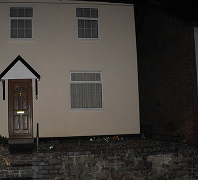
This is the first inside panel, it appears as one of the 3 houses on my road that I have tried to use as a substitute for a panorama camera shot.

This is the second inside panel. The circle inside this panel is a demonstration of where the CD will be inserted. As you can see, the background continues from the previous inside panel, as part of my panorama shot attempt.
This is the third inside panel, and the final one to contain the attempted panorama shot effect. While the implication that the background continues from one panel to the next is clear, the continuation of the image is not accurate or straight. Part of my job in progression towards the final version of the Digipak is to replace these images with those that actually belong to single filmed panorama shot, which I can use to more accurately produce an image that can continue from panel to panel. Some research into panorama shots may be necessary.

Here is the 6th panel, the panel which would feature the lyrics. While the layout is certainly neat and effective, the fact remains that most album lyrics pages do not feature the lyrics of only a single song in the album. Either lyric to every song in my track list must be written up and inserted into the lyrics page, or I use this page for something other than the write-up of song lyrics.
Sunday, 21 October 2012


Saturday, 20 October 2012
Track list:
1. Take me over there.
2. Show me a wonderful time.
3. Hold me, kiss me, give me.
4. Tell my wife, please.
5. Proof.
6. Say the forbidden.
7. Dance all day.
8. Make me laugh, and cry.
9. Never say always.
10. I want you to leave.
11. Show me to right way.
12. Sinner, dinner.
Song no.1: Take me over there is a song that sounds like a classical romantic conceptual song. This song was listed first as the name for it is simple and attractive to a soft rock audience.
Song no.2: Show me a wonderful time is a song title which resembles narrative adventure, romance and happiness. This positive ambience should perhaps intrigue the target audience.
Song no.3: Hold me, Kiss me, Give me is a song title of aliteration and consistency. The title is yet another romantic title, a pattern has developed.
Song no.4: Tell my wife, please is a possibly more negative title, which may appeal to the soft rock audience as based on previous songs and research, they seem to relate a lot to more negative songs. The title is interesting as it sounds like a video where some cheating has been occuring.
Song no.5: Proof, an actual song and the one I am using for my actual music video.
Song no.6: Say the forbidden is an ambiguous title of meaning, possibly using the enigma code to intrigue the audience and album cover viewers.
Song no.7: Dance all day sounds like a typically loud, karaoke style of song which is unusual for a soft rock music video. The contrast from stereotypical genre expectations may mean it's a title of interest to the audience.
Song no.8: Make me laugh, and cry. Much like my Proof video, the emotional content within this video appears to be mixed, which should certainly appeal to my target audience.
Song no.9: Never say always is an oxymoron standard of song title. Much like say the forbidden, the meaning of this title is highly ambiguous.
Song no.10: I want you to leave sounds like another music video filled with negative narrative content, something which may interest the audience and viewers.
Song no.11: This title certainly implies the video property of narrative adventure, a change of pace from the stereotypical version of slow-paced soft rock videos.
Song no.12: Another alliterative title which seemingly relates to another romantic storyline. The alliteration alone should intrigue the audience.
Costume examples:

Shirt option no.1: This is the first shirt choice that I could use to wear in my video. The reasons being simple, the shirt is cheap, old, worn and does not appear to be very well kept. Keeping in mind that the clothing I wear in the music video is supposed to be somewhat messy and unclean to represent the narrative content of self degradation from the character, a simple, cheap shirt such as this one might be a good choice for clothing.

Shirt option no.2: This is the second shirt. Since my star is 18 years of age, this slightly more mature shirt may be a good idea to choose for wearing in the video. Since this type of shirt can usually be seen a trendy fashion within young adult men, perhaps this choice will be better for visually appealing to the target audience I have of young adults.


Jeans of the cheap and baggy variety may be of use for this video. The idea of the clothing in the video is for the man I play to be wearing cheap, worn out clothes that truly present the concept of cheapness, degradation and poor life choices, this jeans type will certainly help to do so.

This hoodie jacket may or may not be worn, unzipped, above the choice of shirt that I use for the music video. This is a simple, old, fairly fashionable piece of clothing that should certainly present the man in the video's concept of youth, as well as poor lifestyle.
Friday, 19 October 2012
Production changes:
This post serves as an update for a change in Digipak production. These are some of the changes I have been making during my Digipak production as opposed to my previous plans noted beforehand. Among the changes are:
Changes to work:
Changes to work:
As previously explained, my front cover was to have a gradient black to white background that would effectively fit in with the image content in front. The main image would be a picture of me being depressed, and half my face would appear on the left side of the cover. The black part of the background would appear over it to represent my emptiness and depression, and loneliness. Then in contrast, the upper right corner of the front cover would slowly transfer over to a white background. Over this would be my planned sketch design that would feature over the white background, as the narrative content of me and my girlfriend in the video as seen in the picture would reflect the white background, not only blending into it, but also being seen as lighter and more positive to the black background image on the other side of the page. However, when I was undergoing Digipak production, it became apparent that the gradient would make the cover appear cheap and poorly produced. I deleted my half face image and sketch design from the front cover, and instead added an alternate picture of me, enlarged it, and then set it to black and white. While this initially appeared very poor as a front cover to me, I started to realise the relation that this new cover idea had with the narrative content of my video was actually very strong. The black and white image represented dullness, boring nature, and well as old fashioned visual content. All of these qualities relate to the pause that I have undergone as a result of the girlfriend break-up my character has had in the music video storyline. The pause shows how my character’s life is a halt and how he is living in the past, a painful one. The slightly pixelated, black and white image of my depressed face really amplifies the illustration that my front cover has to relate to the narrative of my music video. Right now, my current structure of this new idea is that it will be a cover that follows the rule of thirds. AKA my face will appear on the left centre of the cover page, and the text will be separately spaced from the face, appearing in the lower right corner.
As a result of the cover change, my sketch is now no longer going to be featured on it. However, since my poster is being planned to feature the sketch as the same main image (a use of consistency) I have decided that I will still feature the sketch in my Digipak as well. This is where my 6th panel AKA the inserted lyrics page, comes into play. My lyrics page has been arranged in such a way that there is a noticeable large space in the lower right corner featuring no content. This is where my space will be included, as it will certainly add to the visual interest of an otherwise text filled page. This sketch will then be ascended to a more significant role in the poster. It is intended to be the main image, centred in the middle of the page in terms of top to bottom scaling. The sketch may just be added into the lyrics page of the Digipak with no further editing, since the white background of the drawing in contrast to the black background of the page should help it to stand out anyway.
Originally, the title of the track list was supposed to be featured on top of the track list on the back cover, but since most back covers on album Digipak's don't actually feature the title 'track list' I have decided to remove it and just feature the actual list in the centre inbetween 2 border lines.
I previously stated that I would choose between using field images for my inside panels consistent pictures, or using suburban images instead, as both provided certain narrative relevance to the music video. However, I eventually opted to use the suburban images instead of the fields for the following reasons. 1, the suburban images have more direct relative meaning, such as the images showing my house and street, the main location of my music video. Also, the houses, while they initially look nice, were also taken in the dark, but with a flash feature on the camera. This is supposed to represent that in the house, where the man in the video will be, there is darkness, internal depression loneliness, and grief. But there is a light outside the house as aided by the camera flashlight. In terms of narrative meaning, it implies that if the man gets out of this emotional state, like he actually does in the video, then better, lighter life will be waiting ahead. Whereas while fields provide basic illustrative content, bare limited relevance to the music video I have planned.
Subscribe to:
Posts (Atom)